Background

Thursday, May 31, 2012

Always Smiling Clipboard

Hello Peeps! Happy Thursday!

This is my last project for this month. I was perusing the aisles at Dollar Tree (one of my FAVORITE spots!) when I came upon this miniature clipboards. I thought they were adorable so I picked one up (or two or three), not yet knowing what I would do with it but knowing I wanted to use it somehow. It didn't sit around my craft room for long!


Supply List Pink Paislee "Indigo Bleu" - Poplin Yellow Cardstock Authentique "Blissful" - Headlines and Noteables
Ribbon
Other: Dictionary Paper, Clipboard, Scallop Circle Punch, Grey Acrylic Paint


The first thing I did was paint the edges of the clipboard with matching acrylic paint. By doing this my paper measurements didn't have to be exact. And if there is one thing I am not great at, it's being exact.


Once the paint dried, I attached the patterned paper using liquid glue. I added some ribbon to the clip and a small embellishment (which I attached with a safety pin). I popped up the large sentiment along the bottom and added one of the dictionary paper flowers I also made for the card I shared last week. I clipped the picture on so that it can be changed.


Thank you so much for stopping by! If you'd like get up close and personal with any of the projects shared here on the blog, they are on display at Pages From the Heart.


XOXO,
Becky

Wednesday, May 30, 2012

What a Beautiful Day Layout

Hello Peeps!

Becky here again. Today I will be sharing an Easter layout I made. My husband and I hosted Easter for the first time this year. It was a warm day so we had a BBQ in our new backyard. Both of our beautiful moms were there so, of course, I had to get some pictures!


Supply List
Pink Paislee "Indigo Bleu" - Denim, Burlap, Poplin
Pink Paislee "Indigo Bleu" - Shipping Tags
Yellow and Grey Cardstock
Authentique "Blissful" - Tabloids and Noteables
Alphabet Stickers
Butterfly Punch


I used a sketch by the wonderful Allison Davis for this layout. I loved all of the papers I was given so I wanted to use lots of layering. I also gave my sewing machine another try. I cut a 1/2" strip, a 3" strip, and one that is 2 1/2" x 10". I loved the butterfly on the shipping tag so I added some small punched butterflies. To give them some dimension I folded the wings up and only glued the middle down.

Tomorrow I will be sharing my last project of the month. Thanks for reading!

XOXO,
Becky
 

Tuesday, May 29, 2012

it's all the "BUZZ"!


We are all buzzing about Donna's quilling class this coming Saturday. It features the cutest bee you have ever seen and some sweet summer flowers to keep him busy. It starts at 10:30am for only $28 - call today for your space!

Diane has done it again as well with another great mini book - "Cruzin'" will help you relax, you'll be using awesome BoBunny papers and be able to"cruise" through your weekend - this class begins at 1:30pm and is only $28. Be sure to call right away

Friday, May 25, 2012

Sending You a Little Hope

Welcome Peeps!

This is Becky and I am rounding out this month's Design Team projects. Today I am sharing a card I made using a lunch paper bag. I also did some sewing for the first time this month using a machine. It's far from perfect but not too bad either!


Supplies
Authentique "Blissful" - Noteables
Pink Paisley "Indigo Bleu" - Denim and Burlap
Yellow  and Grey Cardstock
Dictionary and Scallop Circle Punch
Paper Bag

I found this card on Pinterest and loved the idea of making a card from a paper bag. I folded both end of the card in and cut a small strip off of the bottom portion so that both ends were open. I then sewed a pocket using the bottom half. I created a card for the inside with a sentiment and embellished with paper and jewels.

The belly band on the original card is what really caught my eye. I added a flower I made using scalloped circles cut from dictionary paper. I found a dictionary at the dollar store a few years ago and I am still using it!

Next week I'll be back with a layout and a project. Happy weekend and thanks for stopping by!

XOXO,
Becky


Thursday, May 17, 2012

Design Team: "Sugar & Spice" 3D Project

Hi, Pages Peeps!

It's Lauren here to share with you my final Design Team project for this month. You can see my first project (scrapbook layout) here and my second project (card) here!


The cute birds from Doodlebug Design Inc.'s Sugar & Spice line cross over very well with their Hello Spring line. And these little birds inspired my birdhouse!


I found this wooden birdhouse and used modge podge to add the paper to the sides of the birdhouse. I tied the ribbon around, added a bird sticker and hot glued the flowers in place. When I was looking at my birdhouse, I realized it needed a little more... bling! I used some purple Stickles and outlined the roof of the house (it also helps hide any paper that doesn't quite cover all of the birdhouse). :) I hope you enjoy this project; it looks great on a desk at work or in a windowsill.


Supplies:
Doodlebug Design Inc.'s Hello Spring Line: Chickadees
Doodlebug Design Inc.'s 
Hello Spring Line:
 May Flowers
Doodlebug Design Inc.'s Sugar & Spice Line: Icons Cardstock stickers
Purple, polka dot ribbon
Paper flowers
Wooden bird house
Modge Podge
Purple Stickles

Thanks for joining me this week!

Lauren

Wednesday, May 16, 2012

Design Team: "Sugar & Spice" Card

Hi, Pages Peeps!

It's Lauren here to share with you my next Design Team project for this month. You can see my first project - a scrapbook layout - here!

The clothesline theme for Doodlebug Design Inc.'s Sugar & Spice line is really just the cutest!


I love the Hangin' Out paper design that I didn't want to layer anything on top of it, so I cut out identical pieces of clothing or little animals and used dimenionals to make them pop. The pearls and Stickles add some bling and I layered "girl" on to white card stock and trimmed around the letters to make sure they stood out against the more busy background. This is a fun card to give to an expecting mother or even as an announcement when you know you're having a baby girl.


Supplies:

Yellow card stock
White card stock
Doodlebug Design Inc.'s Sugar & Spice Line: Hangin' Out (Baby Girl)
Doodlebug Design Inc.'s Sugar & Spice Line: Icons Cardstock stickers
Doodlebug Design Inc.'s Mini Pearls: Baby Girl Assortment
Colorbox ink
Clear Stickles
Brown Sharpie

Stay tuned to see my final project!

Lauren

Tuesday, May 15, 2012

Design Team: "Sugar & Spice" Scrapbook Page

Hi, Pages Peeps!


It's Lauren here to share with you my Design Team projects for this month.


Not knowing any baby girls, I will admit it was tough finding inspiration to create a scrapbook page using Doodlebug Design Inc.'s Sugar & Spice line. But the clothesline on their paper was adorable and provided the inspiration for this layout.


My idea behind this page was for it to be a title page or a page where you have one perfect photo that is to be the focus of a page. The stitching on the left requires a needle and a ruler (and a little bit of patience) with your white floss/twine. I really like the way it came together and I hope you think so, too.


Supplies:

Green 12 x 12" card stock
Pink 12 x 12" card stock
Doodlebug Design Inc.'s Sugar & Spice Line: Sweetie Pie Stripe
Doodlebug Design Inc.'s Sugar & Spice Line: Icons Cardstock stickers
Doodlebug Design Inc.'s Mini Pearls: Baby Girl Assortment
White floss
Brown floss
Mini clothespins
Colorbox inks
Brown Sharpie

Stay tuned to see my other two projects this week!

Lauren

Friday, May 11, 2012

"On the Go" with Bo Bunny


Hi everyone.  This is Debbie with my projects for May.  The assignments this month were to create a 3-D item, a scrapbook page and a card.   My supplies included several sheets of patterned paper from the “On the Go” collection from Bo Bunny along with a coordinating sheet of stickers, alphabet letters and border strips and several sheets of Bazzill cardstock.


One of the sheets, “On the Go Cut-outs”, has four 6x6” panels on one side and a variety of big cutouts on the reverse – perfect for a quick mini book or as the decorative panels on my first project – a banner for a young boy’s room.


The banners are simple 6x12” panels with a notch.  I matted the 6x6” squares on contrasting cardstock and popped them up using foam tape.  The 123 and ABC embellishments were made with Quickutz dies and double-stacked with a bit of foam tape for depth.  A wide panel of striped paper framed with a scalloped border accented with a string of “action” words from the sticker sheet frames the top of each banner.  The center banner has a three dimensional airplane and cloud.  The two side banners feature their own small banners made from stickers from the collection mounted on cardstock scraps and strung on a piece of baker’s twine.

My second project was a scrapbook page using the same collection.  I replicated the banner theme with several strips of the patterned paper anchored with a scalloped border.  A cluster of embellishments, many made from the sticker sheet, accent the bottom of the banner.  Three small circles fill an empty corner to balance out the page.


My final project was a card.  I double-matted one of the large cutouts and placed the large truck behind one of the tiny trucks printed on the argyle patterned paper.  I cut out one of the airplanes, double-matted it, and popped it up to pull a “happy birthday” banner across the top of the page.


I hope you enjoy looking at my projects!

Monday, May 7, 2012

NATIONAL SCRAPBOOKING DAY GIVE AWAY WINNER

Good Afternoon! Well, we know everyone has been waiting patiently to find out who the winner is of our National Scrapbooking Day Basket:

TA DA!  It is:  RUBY DE LA ROSA!


We can't wait to give her the basket full of goodies so.......CALL US SOON RUBY!

Thursday, May 3, 2012

Family Portrait Layout

Hello Pages Peeps, this is Michelle here today with my last project for this month featuring Bo Bunny's "Weekend Market" collection. I made a card, a calendar/mini-album and now a layout. This collection is very versatile and easy to use. Hopefully you found something to inspire you to make your own creation. 

The Reveal
I often choose papers for my photos based on the color scheme rather than theme to match my photos.  Since I had my papers first, I did the opposite. I picked the photos that matched my papers. When I saw the dark blue, mustard yellow and maroon combination of the collection, I immediately thought of these studio portraits my family took in while on vacation in Seoul, as those were the exact colors of my Dad's traditional Korean outfit.

Korean Family Portrait
The Details
One of the patterned papers had suitcases printed on it, so I cut out a few and stacked them alongside my photos. 

Patterned Paper for an Embellishment
I also cut a journaling sticker into the shape of the suitcases and stacked that on top of the cases so that it would blend in with the design. While in Korea, I picked up some Hello Kitty post it notes which featured Hello Kitty and Daniel in traditional outfits, so I added that to the top of the journaling. To finish things off, I added some tiny brads to match the polka dots on the journaling block and one of the patterned papers. 

Journaling Block
For my title, I used the matching yellow alphabet letters in the collection. The letters faded into the yellow background cardstock so I outlined that portion with a black  pen. The upper part of the letters protruded into the dark blue cardstock, so I outlined the top half a white pen for added emphasis. Just find ways to use what you already have in stock. You might surprise yourself with what you come up with. 

Title

Supplies:
Featuring Bo Bunny's "Weekend Market" Collection

Cardstock: Bazzill Basics
Patterned Papers: Bo Bunny “Weekend Market”
Sticker: Bo Bunny
Ink: ColorBox
Brads: Creative Impressions
Pen: Pentel, Sakura
Sticky Notes: Sanrio


Weekend Market Collection
Stay tuned next week to see the new projects from another design team member. 

Thanks so much for stoppin' by,
Michelle

SoCal Shop Hop Calendar Idea

Hello Pages friends, this is Michelle back again today with my second Bo Bunny "Weekend Market" project.

The Shop Hop
Are you ready for this year's Shop Hop? There are 37 stores participating, including Pages from the Heart, so make sure you stop in and purchase your passport. The theme this year is "Wacky Holidays" and the Shop Hop runs from July 20 - August 5, 2012. Last year I had a lot of fun visiting a few stores with fellow design team member, Becky.

Shop Hop 2011
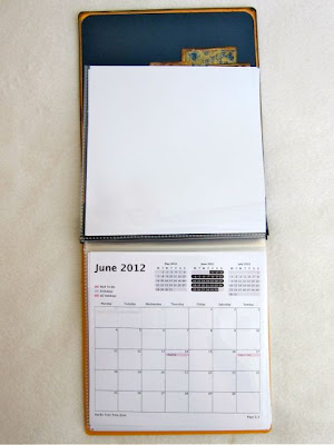
After the hop I ended up with a pile of 6 x 6" make and takes. I eventually finished them and placed them in made an album that I made from an embellishment box. 

Steamer Trunk Mini-Album 2011
This year I decided to get ahead of the game a bit, and have my album done ahead of time so that pile of make and takes won't seem so overwhelming. 


The Reveal
Since this year's theme is "Wacky Holidays," I thought a calendar would be a nice change from a mini-album. I took a cardstock 6 x 6" album that I already had and turned it sideways. My album is a plain orange one from SEI from their preservation series, but you can use any brand of 6 x 6" albums or make your own cover from chipboard and add some page protectors inside. 

Shop Hop 2012 Calendar Mini-Album

I decorated the cover with images I cut from Bo Bunny's Weekend Market patterned papers and mixed it with the matching Combo Sticker Sheet. 


I printed out some 6 x 6" monthly calendars from iCal and inserted them in the bottom half of the page protectors. You can use any calendar software or online sites. I also decorated the inside cover. 


I intentionally left the rest of the pages blank that faced the calendar pages to later hold my make and takes from the shop hop. If I don't think of a way to organize them, I end up with a pile of 6 x 6" make and takes that I'll never get to. If I've already made my album, or in this case, calendar, then I'll be sure to finish them up when I get home so I can complete my project. 


Supplies:
Featuring Bo Bunny's "Weekend Market" Collection
Cardstock: Bazzill Basics
Patterned Papers: Bo Bunny “Weekend Market”
Stickers: Bo Bunny
Alphabet Stickers: Bo Bunny, Authentique
Ink: ColorBox
Ribbon: May Arts
Brads: Creative Impressions
Pen: Sakura
Album: SEI
Calendar Pages: iCal

Weekend Market Collection
I hope you can participate in this year's Shop Hop. Stop by Pages for more details on this fun event. 

Thanks so much for stoppin' by,
Michelle


Wednesday, May 2, 2012

You Are Picture Perfect!

Hello Pages Peeps, this is Michelle here today to bring you share with you my May projects this week. I made three projects total, and I'll be posting one a day.

The Collection
I worked with Bo Bunny's "Weekend Market" collection which features travel themed images with rich colors and regal designs. This collection would not only be good for travel and vintage photos, it would also be perfect for more masculine themed projects. If you want a closer look at individual patterned papers or to see the entire collection, please go here. For all three of my projects I used three of the patterned papers and the cardstock sticker sheet shown below. 


Bo Bunny's Weekend Market Collection

The Reveal
For my first project I was inspired by the sticker that read "picture perfect" from the sticker sheet so I designed a card built around that sentiment. 

Since the colors in this collection were more masculine, I decided to make a card for my nephew. 
To start, I placed some color blocks in the background. For an extra touch I added some tone on tone brads on a few of the polka dots. I combined the alphabet stickers with the cardstock sticker from the sticker sheet to build a sentiment block. I popped up the sentiment with some foam tape for some dimension and finished it off with a sheer bow. 
Card Exterior - You are Picture Perfect

I wanted to make the card a bit more dynamic than normal since my nephew is 5 years old and may not appreciate a plain card. I decide to make him a pop-up with his own image, then he might take more notice of it. 

Card Interior - Floating Pop-up Images
I created the pop up using some paper punched balloons, a photo and acetate strips. I then covered up the bottom with a border punch strip. I made this style of card once before. If you are interested in seeing my other sample or want a tutorial, please follow this link to my blog. 

Here is a side view of the pop-up. 

Side View of Floating Pop-up
Supplies:
Featuring Bo Bunny's "Weekend Market" Collection
Cardstock: Bazzill Basics
Patterned Papers: Bo Bunny “Weekend Market”
Sticker: Bo Bunny
Border Punch: Stampin’ Up
Punch: Fiskars
Ink: ColorBox
Ribbon: May Arts
Brads: Creative Impressions
Acetate: 3M

So come on over to Pages from the Heart if you are interested in this collection or want to see any of the design team projects in person. 

Thanks so much for stoppin' by,
Michelle

Tuesday, May 1, 2012

Only A Few Spots Left

Prima Mixed Media Journal Album with Sherry Mendoza

Do you want to learn to take your paper crafting to the next level?
Sherry is coming all the way from the land downunder to teach this stunning technique based Prima Mixed Media Journal Album

In this workshop, Sherry incorporates many different Mixed Media techniques and styles.
You will play with gorgeous Prima products and gain some expert insight and instruction for a brand new paint product, PanPastels which are the crafters latest "must-have” item! You will get messy with Ranger sprays, Faber Castell pens and as well, you get a specially designed chipboard sheet from Words or Whatever!

Sherry will teach you blending techniques with different mediums such as texture paste, gel medium, gesso and acrylic paints, creating some beautiful backgrounds for your Mixed Media Journal.
During this workshop Sherry is also is going to teach you a very cool photo transfer technique that can be used in most areas of your crafting portfolios.

Ladies be prepared to get your hands dirty!

As an added bonus, all class attendees will receive a copy of the new Prima Art-Zine ‘My Prima Place’, of which Sherry is the Editor!